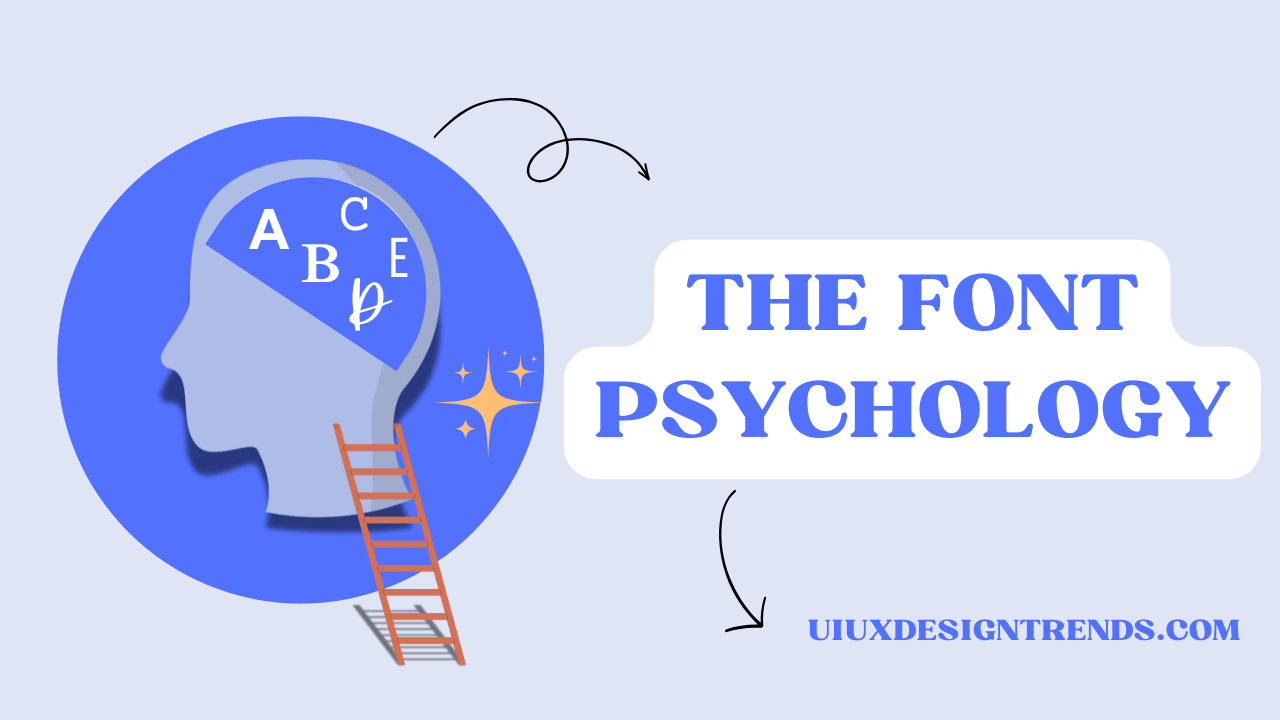
Introduction
Fonts play a very important role in design, influencing perception, brand identity, and user experience. When one is designing a website, creating a logo, or creating marketing materials, the choice of an appropriate font can have a huge impact. Understanding fonts in design and the psychology of fonts helps make informed decisions that align with brand messaging and user expectations.
Understanding Fonts in Design
Fonts in design are more than just a decorative feature; they are visual communicators. A font can be emotional, professional, or urgent. Typography, which includes the selection of a font, spacing, and alignment, is an integral part of visual hierarchy and readability.
Types of Fonts in Design
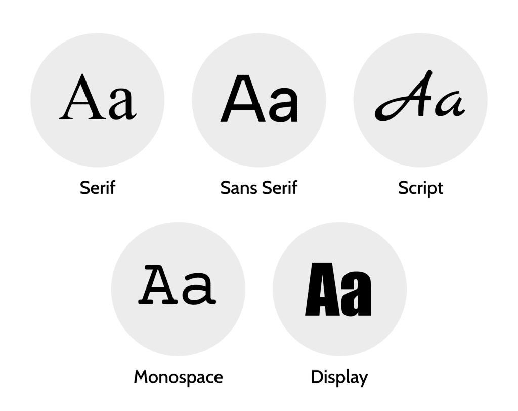
Fonts can be categorized into five main types, each with its unique characteristics and best uses:
Serif Fonts – are characterized by the presence of small strokes, known as serifs, at the ends of letters, which imparts a traditional and authoritative appearance. Common examples of serif fonts include Times New Roman, Georgia, and Garamond. These fonts are frequently employed in newspapers, books, and professional business materials.
Sans-Serif Fonts – The end strokes are absent in sans-serif fonts; they have a modern, clean look. Examples include Arial, Helvetica, and Roboto. They are commonly found in digital design, websites, and tech brands.
Script Fonts – Inspired by cursive handwriting, script fonts add elegance and creativity. Examples include Pacifico and Lobster. They can be used in invitations, luxury branding, and artistic projects.
Display Fonts – These are decorative and attention-grabbing, making them ideal for headlines, posters, and advertisements. Examples include Impact and Bebas Neue.
Monospace Fonts – In these fonts, each letter takes up the same space, making them excellent for coding and technical documents. Examples include Courier and Consolas.
Font Psychology: How Fonts Influence Perception
Psychology of fonts is a crucial concept in typography, helping designers and marketers understand how different fonts affect human emotions and decision-making. Let’s break down how each font category influences perception:
1. Serif Fonts: Trust and Tradition
Serif fonts are said to be authoritative, reliable, and traditional. This is the reason why many legal firms, financial institutions, and news publications prefer serif typefaces. For instance, The New York Times uses a serif font to give it credibility and maintain journalistic integrity. Vogue magazine uses a serif font to give it a sophisticated and high-fashion feel.


2. Sans-Serif Fonts: Modern and Minimalist
Sans-serif fonts appear fresh, clean, and accessible. Tech giants like Google and Apple use sans-serif typography in their branding to communicate simplicity and innovation. A startup aiming for a sleek and contemporary identity should opt for a sans-serif font. Another great example is Spotify, which employs a sans-serif font to convey a modern and minimalist aesthetic, reinforcing its identity as a sleek and innovative digital music platform.


3. Script Fonts: Elegance and Creativity
These fonts convey character and elegance, making them best suited for invitations, luxury products, and fashion brands. For instance, consider the Coca-Cola logo; it uses a script font to elicit happiness and nostalgia. Another relevant example is Instagram, which uses a script font in its logo to emphasize creativity and personalization.


4. Display Fonts: Bold and Expressive
Display fonts are attention-grabbing and leave a long-lasting impression. They are more effective in advertising, movie posters, and branding efforts that wish to stand out. For example, a brand like Fanta uses a display font to convey a sense of fun and energy. Similarly, the logo of Disney uses a custom display font to enhance its whimsical and magical brand identity.

5. Monospace Fonts: Technical and Neutral
Monospace fonts are generally related to coding, data input, and typing. These fonts convey a message of precision and clarity, so they are really perfect for technological-oriented designs. For instance, GitHub uses monospace fonts within the coding interface to enhance the legibility and accuracy.

Best Practices on Choosing Fonts for Design
1. The selection of the fonts must be in accordance with brand identity.
The font used should reflect the character and personality of the brand. A luxury perfume brand would go for a more elegant script, while a tech start-up might need a clean sans-serif font.
2. Ensure Readability
A beautiful font will not work if it cannot be read. It is also essential that the body text remain readable and legible, particularly on digital screens.
3. Maintain Visual Hierarchy
Guide attention through the text with varying font sizes and weights. Headings are bold and big, whereas the body texts should be small enough to be read.
4. Limit Your Fonts
Overuse of multiple fonts creates an overcrowded, non-professional impression. Opt for two or three harmonious fonts.
5. Be aware of cultural associations
Fonts have different cultural meanings. For example, Gothic fonts are usually associated with history or fantasy themes, while rounded fonts are usually associated with friendliness and approachability.
Usage of Fonts in Design
1. Web Design
Typography in websites is part of the user experience. Open Sans, Lato, and Roboto are some of the most popular fonts because they are optimized for readability on screens.
2. Branding and Logos
The fonts to be used in branding must be unique and distinctive. In the Nike logo, for example, the strong sans-serif type speaks of strength and boldness. For Netflix, it uses a bespoke sans-serif to ensure clear digital readability and a fresh look.
3. Marketing and Advertising
The fonts to be used in advertisements must stand out. One may use a display font to highlight the headline while a sans-serif type ensures that the descriptive text is legible.
4. Print Media
Books, magazines, and newspapers rely mainly on serif fonts because they make reading even long texts easier.
5. Social Media Graphics
Most social media users only pay attention for a very short period of time, so the typefaces used have to be strong and attention-grabbing. Handwritten or script fonts can add a personal touch to social media graphics.
Conclusion
The selection of fonts in design is crucial for effective communication, branding, and user engagement. By comprehending the psychology of fonts, designers and marketers are able to make informed decisions that strengthen their message and foster a connection with their audience. You’re designing a website, creating a logo, or developing an advertisement. The font you choose makes all the difference. Always read from the page, align your fonts with brand identity, and use font psychology to make your message powerful.
For further exploration of different font types and their uses, visit Figma’s Font Guide.
Want to dive deeper into UI/UX design? Click here for more insightful blogs: uiuxdesigntrends.com
Frequently Asked Questions
What does font say about personality?
Fonts can reveal a lot about personality by conveying specific traits:
- Serif Fonts: Traditional, reliable, and professional.
- Sans-Serif Fonts: Modern, clean, and straightforward.
- Script Fonts: Creative, elegant, and personal.
- Display Fonts: Bold, energetic, and attention-grabbing.
The font you choose reflects how you want to be perceived, whether formal, innovative, artistic, or dynamic.