Auto Layout in UI UX: An Introduction
Auto Layout is an essential tool for anyone who uses or wants to use Figma. It makes the designing process go more smoothly. Auto Layout automatically resizes and aligns your components as you add or edit elements on the screen. This blog will help you understand Auto Layout better and use it effectively.
1. Auto Layout Basics
First, let’s define what Auto Layout is.
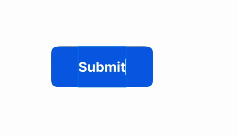
Auto Layout is a feature in Figma that automatically aligns and resizes elements based on spacing and padding settings. Imagine you have created a button and written “Submit” on it. Now if you change this button text to “Submit Now”, Auto Layout will adjust the size of the button, without disturbing the design.
Auto Layout is very helpful when you are creating responsive designs. By using this feature, you can easily manage complex layouts.
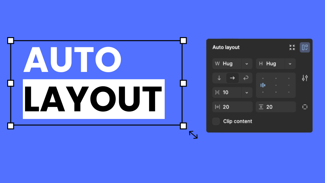
2. Setting Up Auto Layout in Figma
- To add Auto Layout, follow these steps:
- Select the elements that you want to add in Auto Layout.
- Click on the “Auto Layout” button on the right side in the sidebar.
- Now use the configuration options which include direction, spacing, and padding.
Pro Tip: “It is important to group the elements to apply Auto Layout. Auto Layout gets applied properly only after grouping.”

3. Exploring Direction Options: Horizontal vs. Vertical
Direction is very important when you’re defining a layout. Auto Layout has 2 main directions: horizontal and vertical.
- Horizontal Layout: Elements are aligned side-by-side, like with button icons or in profile details cards.
- Vertical Layout: A top-to-bottom alignment that’s best for stacked designs, like blog or article layouts.
Example: Imagine a profile card with a profile picture and text. If you use a horizontal layout, the image and text will appear side-by-side. In a vertical layout, the image will appear above and the text below.
")
4. Mastering Spacing & Padding
Defining spacing and padding is very important in Auto Layout.
- Spacing: This determines the distance between elements. For example, if you have three buttons, spacing defines the gap between them.
- Padding: Padding determines the space between the frame and the edges of elements, which helps balance content evenly within the box.
Pro tip: “Keep padding and spacing values consistent to ensure a clean and polished design.”
")
5. Resizing Modes in Auto Layout
Resizing modes help adjust elements to the desired size:
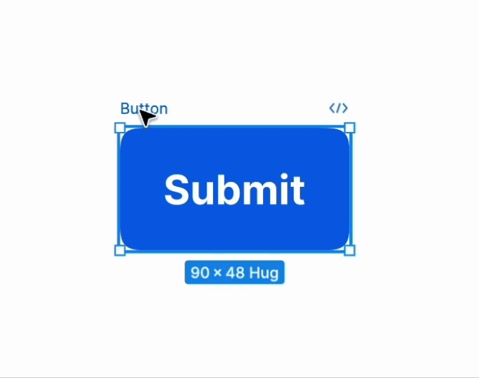
- Hug Contents: This mode adjusts elements according to the size of their content. These buttons are perfect for text changes.
- Fixed: The element is locked at a fixed size, whether the content changes or not.
- Fill Container: This mode stretches elements according to the available space, which is best for responsive layouts.


6. Using Auto Layout for Components & Responsive Design
Another strength of Auto Layout is that it makes responsive design easy. In responsive design, your layout should auto-adjust to different screen sizes, and Auto Layout helps a lot in this
When you create responsive components, you can test them on different screens to make sure they look the same on every screen. With Auto Layout, you can easily manage layouts from small to large screens.
Pro Tip: “After creating a responsive component using Auto Layout, test it on both desktop and mobile.”
7. Nesting Auto Layouts
For complex layouts, you can nest multiple Auto Layouts together.
For example, design a card with an image, title, and button. First, place the image and title in one Auto Layout, then the button in another. Finally, nest both Auto Layouts within a parent Auto Layout. This bested structure is extremely useful in complex layouts, where multiple elements must be arranged properly.
8. Combining Auto Layout with Variants
Combining Auto Layout with variants improves flexibility and consistency. Imagine you are creating different button states – a primary button, a secondary button, and a disabled button.
Group these buttons into a component set with Auto Layout, and define each button as a variant. This makes your designs very flexible and organized, and you can easily use the same components multiple times.
9. Common Mistakes to Avoid
Following are some common mistakes beginners can make when using Auto Layout:
- Inconsistent spacing: Make sure every frame has the same spacing values.
- Ignoring padding: When your design looks packed, don’t forget to include padding between frames and elements.
- Not nesting correctly: To maintain consistency in hierarchy and alignment, it is important to nest elements correctly in complex layouts.
Conclusion: Final Tips and Tricks
Now let’s recap a little. Auto Layout is a powerful tool that makes your design process quite streamlined and responsive. In this blog, we have covered Auto Layout basics, settings, spacing and padding, resizing modes, responsive designs, and nesting. Now you can use Auto Layout confidently.
Frequently Asked Questions
What is the difference between fill and hug in Figma?
Fill makes the element stretch to fill the available space, while Hug resizes the element to fit its content without stretching.
What is nudge in Figma?
In Figma, nudge refers to the action of moving an element by small increments using the arrow keys on your keyboard. It helps to precisely adjust the position of objects without dragging them manually. The default nudge distance is 1px, but you can increase it by holding the Shift key while nudging.
What is the difference between component and auto layout in Figma?
A component in Figma is a reusable design element that maintains consistency across instances, with changes made to the master component reflected everywhere. Auto Layout is a feature that automatically adjusts the size and position of elements based on their content or container, enabling flexible, responsive designs. While components focus on reusability, Auto Layout handles adaptability in layouts, and both can be used together for efficient design workflows.
What is the command for auto layout in Figma?
In Figma, you can apply Auto Layout by selecting the elements you want to include and then pressing Shift + A. This will wrap the selected elements in an Auto Layout frame, allowing you to adjust their spacing and alignment automatically.