Introduction
Ever wondered what always gets clicked the most on an app or website? Exactly—buttons! These drive user actions through small elements, and are a key part of their design experience. If a button is designed correctly, it can guide the user without any thinking. Let’s learn in this blog how to design buttons that are both visually attractive and functionally strong!
Understanding the Types of Buttons in Figma
There are different kinds of buttons, each with its own role. Each brings the user’s attention to a different level. Figma makes it easy to create and customize these buttons to suit your design needs. Let’s explore some common types and their purposes:
- Primary Button: This is the main action on the page, like ‘Sign Up’ or ‘Buy Now.’ Usually in bright contrasting colors, it catches the user’s attention.
- Secondary Button: Secondary buttons are used for secondary actions like ‘Learn More’ or ‘Cancel’. They use a more muted color than the primary button.
- Tertiary Button: It is used for less conspicuous actions such as “view details.” It is nearly invisible but it is there.
- Ghost Button: These are semi-transparent or outlined buttons. Their use is often necessitated when a minimalist appearance has to be produced.

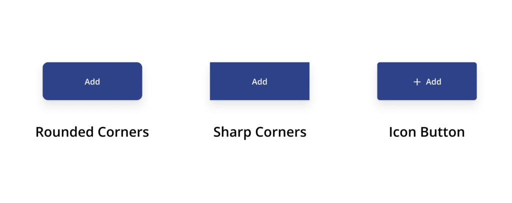
Exploring Button Shapes in Figma
The shape of a button plays a significant role in the design’s look and feel:
- Rounded Corners: These buttons give a friendly and approachable feel. They are more accessible and popular in apps because they are easy to tap.
- Sharp Corners: These buttons look very professional and formal in general and are mostly found on corporate and business sites.
- Icon Buttons: These are used for most of the actions; the trash can would be a delete button, or like button would be in heart shape.
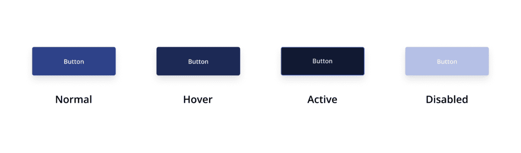
Button States in Figma
Button states are crucial for interactive design, providing visual feedback to users. Here are the key states:
- Hover State: When hovered over the button, the color or shadow changes a little and makes it look click-able.
- Active State: When clicked, it gives a ‘pressed’ effect, assuring that something is on action.
- Disabled State: This is a button that is not yet clickable and generally appears in grey or dull color.
Placement and Spacing: Where to place which button?
Button placement important for user flow:
- Clear CTA (Call-to-Action): Place the main button in such a way that it is prominent and draws the user’s attention to click on it.
- Adequate Spacing: Ensure that buttons are not overcrowded, and there is enough space between them so that users can easily tap on them.
Auto Layout for Buttons in Figma
Auto Layout is a robust feature in Figma that could help improve your button designs to be more flexible and responsive.
When designing buttons, using Auto Layout helps you:
- Easily Adjust Button Sizes: With Auto Layout, your buttons can automatically resize based on the content inside them. This is especially useful when text length changes, ensuring the button always maintains proper padding without manual adjustments.
- Maintain Consistent Spacing: Auto Layout ensures that buttons stay well-aligned and spaced correctly, even when the layout is adjusted or when the button content changes (e.g., text updates).
- Create Responsive Button Designs: When designing for multiple screen sizes, Auto Layout helps your buttons stay flexible and adapt to different widths, ensuring they look great on all devices.
For example, if you’re designing a primary button and later want to test different text lengths (like ‘Buy Now’ vs. ‘Add to Cart’), Auto Layout will ensure the button’s padding and spacing are consistent regardless of text size.
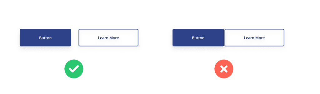
Color Selection – Create a Visual Hierarchy
Color selection is very important for buttons so that they are highlighted separately:
- Primary Colors for Important Actions: Use bold and contrasting colors for primary buttons to attract the user’s focus.
- Secondary Colors for Supporting Actions: Muted or less bright colors are perfect for secondary buttons so that they don’t conflict with the primary action.
Microcopy – The text on the button should also be impactful
The text on a button, known as microcopy, should be clear and action-oriented:
- Use Action Words: like “Get Started,” “Explore,” “Learn More” – It should be clear and direct.
- Be Specific: Avoid Ambiguous words, such as “Click Here,” Because it does not clearly tell what the action will be.
Accessibility – Make Buttons accessible for all
Designing for accessibility ensures your buttons are usable by everyone:
- Color Contrast: Use high contrast colours which are easily distinctive to visually impaired users.
- Screen Reader Labels: Label the buttons to be read by a screen reader.
- Size and Tap Targets: Make sure your button is large enough so the user can tap easily using touch devices.
Common Button Design Mistakes to Avoid
Even though you have the basics down, there are a few common mistakes you should avoid:
- Too Many Buttons: Too many buttons on a page can overwhelm the user, so it’s better to keep buttons minimal and focused.
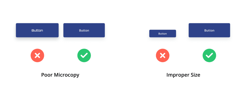
- Poor Microcopy: Do not make the text of the button square in shape, which may leave the user confused.
- Improper Size: Don’t keep the size of the button so small or big that it does not look functional or visually appealing.
Conclusion
This is the ultimate guide to designing buttons that can elevate your UI designs. Don’t underestimate the power of these small elements—even a tiny button can have a big impact on the user experience. With the right design choices and attention to detail, you can create buttons that are not only visually appealing but also highly functional. So, next time you design a button, remember these tips and let your creativity shine in Figma!