
A sidebar menu is an essential part of what makes a website navigation organized, accessible, and seamless; can you envision yourself browsing through a website and feel that the whole process was rather easy and efficient? More often than not, a good navigation system plays a big role. Research shows that 70% of users rely heavily on sidebars for quick navigation—making it a crucial element in your design strategy.
In this blog, we’ll explore the best UX practices for designing a sidebar menu that boosts usability and engagement. Let’s dive deep into how to make sidebars functional, intuitive, and delightful for your users.
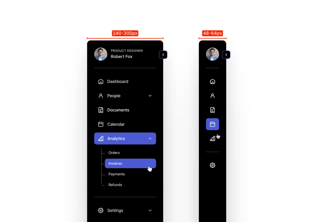
1. Optimal Sidebar Width
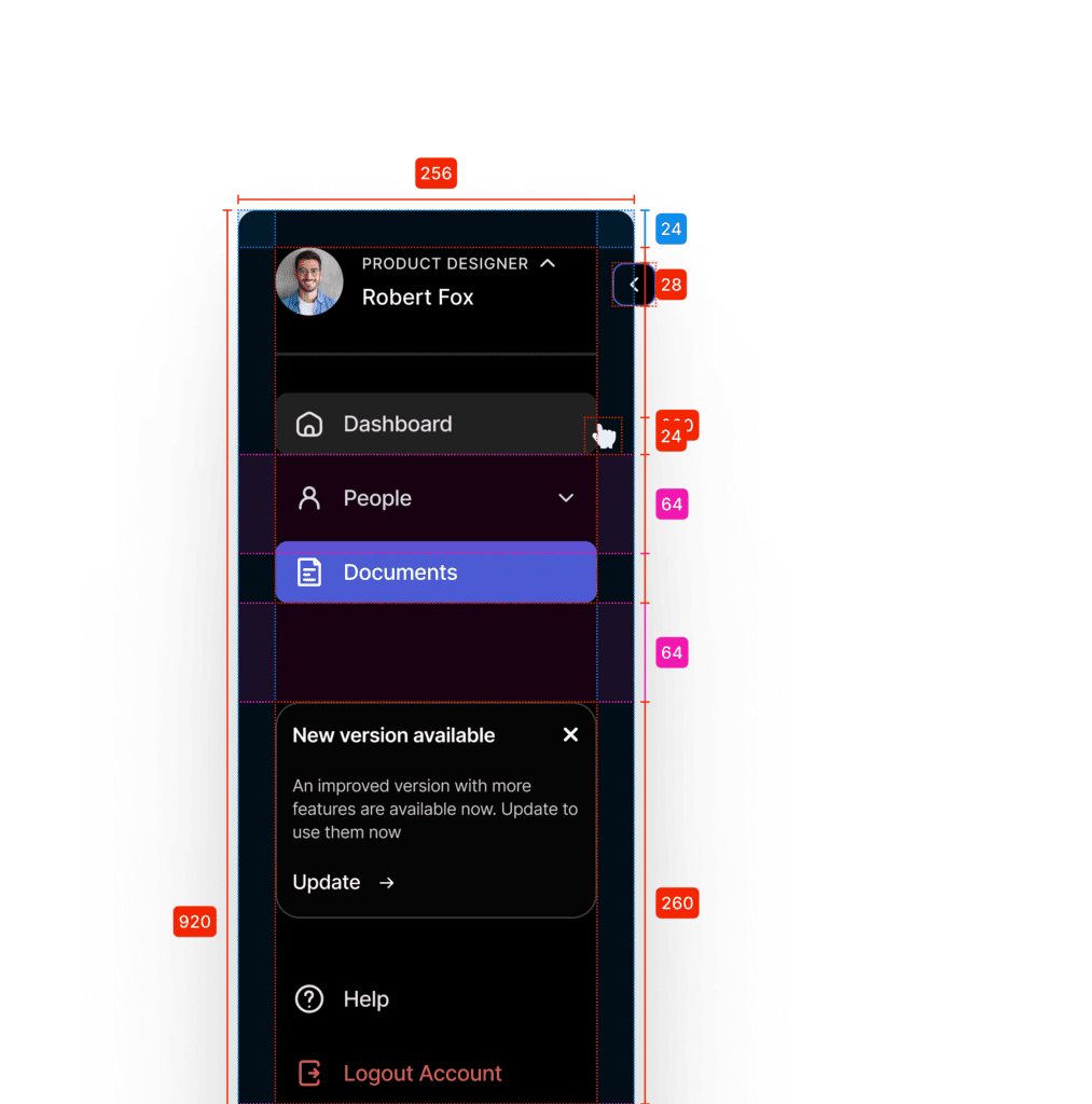
Why Width Matters: One of the most common mistakes in designing sidebar menus is using widths that are either too narrow or too wide. A sidebar menu should balance between content space and visibility of navigation items.
Best Practice:
- A sidebar width of 240 to 300 pixels works well for most designs.
- For a collapsed sidebar, a width of 48 to 64 pixels is sufficient to display recognizable icons.
- For mobile devices, a collapsible or slide-in sidebar provides optimal real estate management.
Example: Consider the sidebar in tools like Figma. Their widths provide enough space for icons and text while avoiding clutter.
Pro Tip: Allow users to resize the sidebar menu for a more personalized experience—especially in productivity tools where users spend a lot of time.
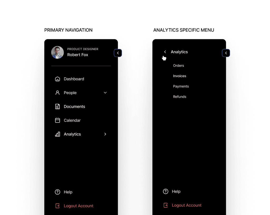
2. Switch Navigation Dynamically for Context
Why Context Matters: Static menus that don’t adapt to different user actions can hinder navigation. Contextual sidebars enhance usability by showing relevant options based on the current page or action.
Best Practice:
- Implement dynamic menus that change contextually—for example, showing document-specific actions when working in a file editor.
- Use icons and labels that update dynamically based on the user’s position in the application.
Pro Tip: Always include a “Back to Main Menu” to allow users to easily return to the primary navigation.
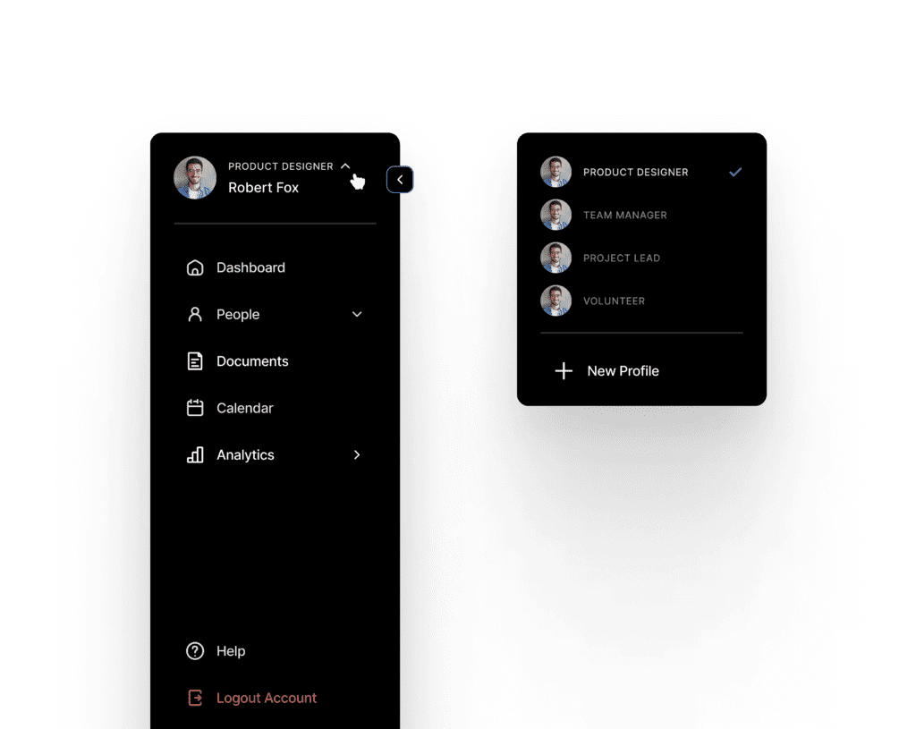
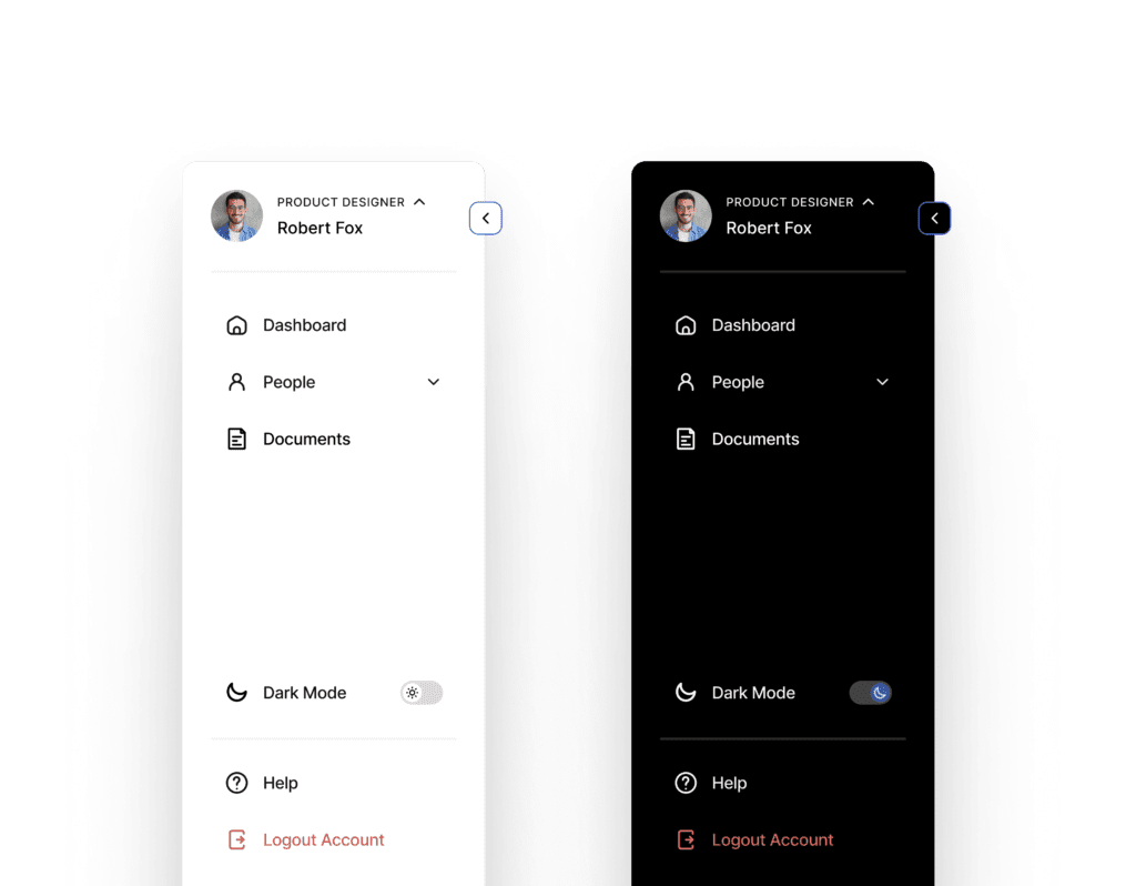
3. Easy Account Switching
Why Account Switching Matters: Many users manage multiple accounts on platforms—from business tools to social media. Complicated navigation for switching accounts can lead to frustration.
Best Practice:
- Place an account-switching option prominently at the top or bottom of the sidebar.
- Use avatars or profile thumbnails to help users visually differentiate between multiple accounts.
Example: Gmail allows users to switch between accounts seamlessly via the sidebar profile icon.
Pro Tip: Include visual cues like company logos, avatars, or color codes to help users quickly identify different accounts and minimize selection errors.
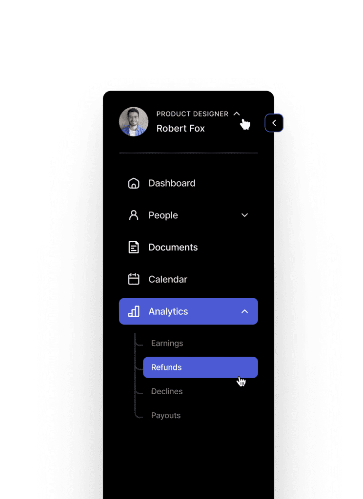
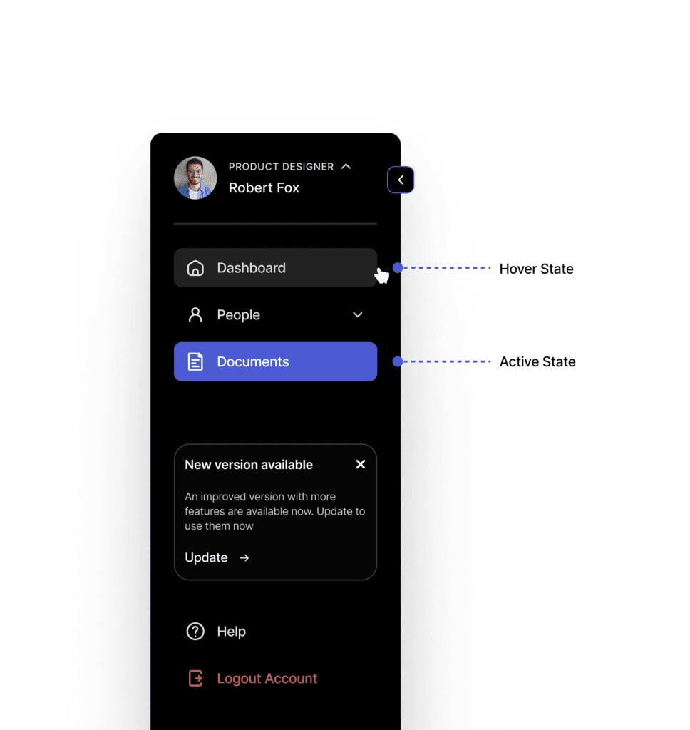
4. Expandable Sub-Items for Hierarchical Depth
Why Expandable Items Matter: Not all menu items need to be visible at once. A nested, expandable design helps maintain a clean interface while still providing depth when necessary.
Best Practice:
- Use disclosure icons (like arrows or plus signs) for collapsible sub-menus.
- Maintain clear visual hierarchy—for instance, indenting sub-items under parent categories.
Example: Notion uses a sidebar where sections can be collapsed or expanded, giving users control over the menu’s complexity.
Pro Tip: Remember to animate the expansion to make transitions smoother and more intuitive.
5. Dedicated Space for Notifications and Updates
Why Update Space Matters: Users appreciate real-time feedback and updates directly in the navigation.
Best Practice:
- Use the bottom area within the sidebar for notifications, messages, or updates.
- Use badges or indicators to draw attention without overwhelming the user.
Pro Tip: Provide options to dismiss or snooze notifications directly from the sidebar.

6. Seamless Mode Switching
Why Mode Switching Matters: Different modes—like light/dark mode—are becoming standard for accessibility and user preference.
Best Practice:
- Include a toggle for switching modes directly in the sidebar.
- Use universally recognized icons, such as a sun/moon for light/dark mode.
Pro Tip: Save user preferences so that mode settings persist across sessions.
7. Incorporate Clear Labeling and Iconography
Why Clear Labels Matter: Ambiguous icons or unclear labels can confuse users, leading to poor navigation experiences.
Best Practice:
- Combine icons with text labels to improve comprehension.
- Use familiar symbols that align with common UX patterns.
Pro Tip: Avoid using too many abstract icons without context—clarity always trumps minimalism.
8. Implement Hover and Active States
Why Visual Feedback Matters: Highlighting hover and active states provides users with important interaction cues.
Best Practice:
- Use color changes or subtle shadows to indicate hover and active states.
- Maintain consistency in your design system for these effects.
Pro Tip: Make hover effects responsive by adding slight animations for a smoother experience.
9. Use Sticky Sidebars for Persistent Navigation
Why Stickiness Matters: Users benefit from a persistent menu that remains accessible while scrolling.
Best Practice:
- Keep the primary sidebar fixed so it’s always available.
- Use scrollable secondary panels within the sidebar if necessary.
Pro Tip: Ensure sticky sidebars don’t overlap or obstruct content on smaller screens.
10. Prioritize Accessibility in Sidebar Design
Why Accessibility Matters: Inclusive design ensures that sidebar menus are usable by all users, including those with disabilities.
Best Practice:
- Follow WCAG guidelines for contrast, focus indicators, and keyboard navigation.
- Support screen readers by using ARIA roles and labels for sidebar elements.
Example: Google’s Material Design guidelines emphasize accessibility in all UI components.
Pro Tip: Test your sidebar navigation with accessibility tools to identify and fix usability gaps.
Wrapping Up
A sidebar menu that has been carefully planned will improve navigation, increase user satisfaction, and make key actions accessible. By focusing on optimal width, dynamic content, easy account management, collapsible sub-items, real-time updates, mode switching, clear labeling, visual feedback, sticky navigation, and accessibility, you’ll create a sidebar that users love interacting with. Remember, effective navigation is not just about functionality—it’s about delivering delightful, intuitive experiences that keep users coming back.
So, the next time you’re designing or revamping a sidebar menu, revisit these best practices. With a user-centric approach and smart design choices, your sidebar will be both beautiful and practical—a winning combination!
Want to dive deeper into UI/UX design? Click here for more insightful blogs: uiuxdesigntrends.com