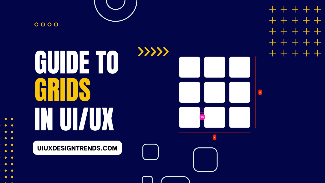
Introduction
In todays digital world, role of grids in UI/UX design is significant. If you design web or app then you must understand the importance of grids. Structured layouts not only make designs look neat but also improve user experience. So, in this blog let us look at a detailed breakdown of grids in ui/ux– from margins, gutters, and columns to soft and hard grids!
What is a Grid?
First of all, what are grids? In simple terms, grids are a system that improves alignment and organization in the design. This framework helps in placing content systematically, which makes the design look organized and visually appealing. Grids in ui/ux also make it easier to replicate the design, ensuring consistency across screens and devices.
“Think of grids as the skeleton of a design – they provide structure, ensuring everything is in its right place.”
Basics of Grids in UI/UX
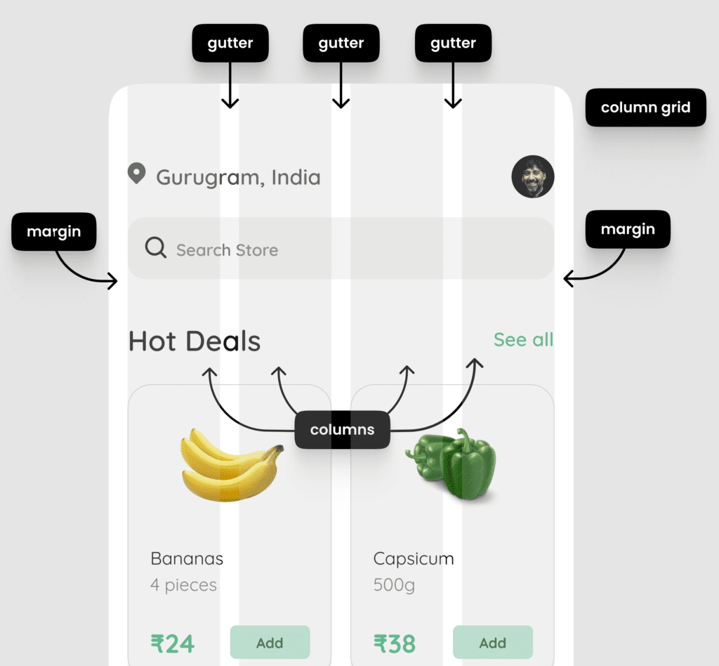
When it comes to grid structures, there are some basic terms every designer should know. These terms are: Margin, Gutter, and Column. Let’s understand each in detail.
- Margin: The space on the outer edges of a design is called margin. This empty space gives boundaries to the design and ensures that the content does not stick to the edges.
- Gutter: The space between the columns is called gutter. This is the horizontal and vertical space that divides the different columns and gives breathing room to the content.
- Column: These are vertical blocks that align content in a grid. Placing content in columns helps create organized layouts, and is very important for responsive design.
- Column Grid: When multiple columns are aligned in a structure, it is called a column grid. This is a common approach in web and app designs, especially when creating responsive layouts.
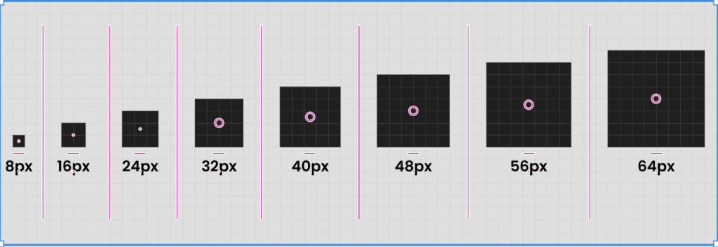
8-Point Grid System
A popular approach in UI/UX design is the 8-point grid system. This system organizes design elements and spacing in multiples of 8 pixels. If you need to add padding, margin, or spacing, it will be in multiples of 8 px – such as 8px, 16px, 24px, etc.
Advantages of the 8-Point Grid System in UI/UX:
- Consistency: This creates a uniform appearance across elements and screens.
- Efficiency: Coding and alignment becomes simple for developers and designers.
- Responsive Design: The 8-point grid makes it easy to scale designs to different screen sizes.
Types of Grids in UI/UX
There are different types of grids that fulfil different design needs.
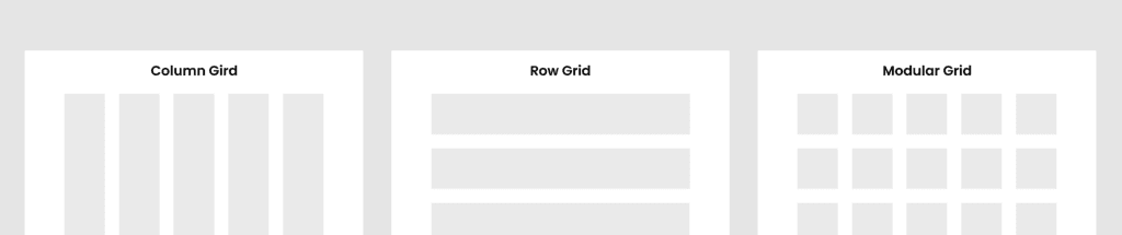
1. Column Grid
Column grid is divided into vertical columns which keeps the content structured and aligned. This grid is especially useful in websites and web applications where the content is spread horizontally. The number of columns in column grid depends on the screen size and layout.
2. Row Grid
In a row grid, content is aligned in horizontal rows. This layout is mostly seen in galleries or image-heavy designs, where it is convenient to scroll content vertically. Row grids make the user flow natural and intuitive.
3. Modular Grid
Modular grids contain a combination of columns and rows, which provides a structured and balanced layout. Modular grids are used for complex designs such as e-commerce websites or dashboards, where content has to be divided into categories.
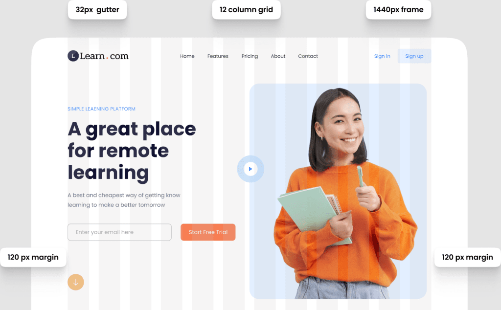
Standard Website Grid
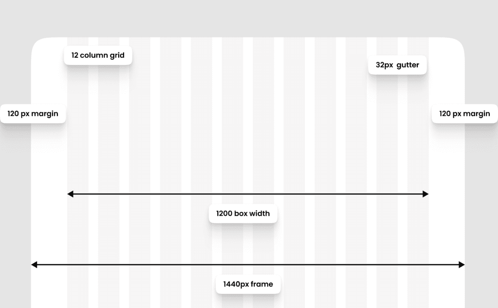
Website grids have some common standards that designers follow. The size of columns, margins, and gutters is optimized for a consistent experience.
- Standard Screen Size: The standard width of website grids is 1440px.
- Columns: Usually, a 12-column grid layout is used.
- Margins: 80px to 120px margins are common in 1440px screen size layouts.
- Gutter Width: Common gutter width is 24px or 32px, which maintains spacing between columns.
A well-defined website grid makes designs look neat and improves readability for the user.
Standard Mobile Grid
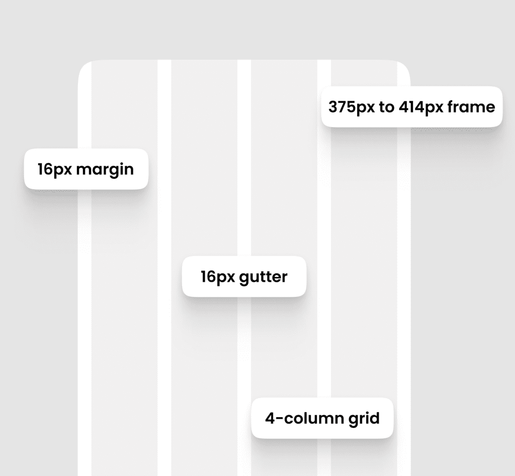
The layout is different in mobile grids as screens are small and space is limited.
- Standard Screen Size: Screen widths of 375px to 414px are standard (for iPhones and common Android devices).
- Columns: 4-column grids are common in mobile layouts for a clear, uncluttered look.
- Margins: Margins are smaller on mobile, around 16px.
- Gutter Width: A gutter width of 16px is common for mobile layouts, which maintains readability without working the content.
Consistency and clarity are crucial in mobile grids so that the design is compact and easy-to-navigate.
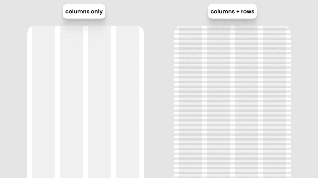
Soft Grids vs Hard Grids
Grids are generally divided into soft grids and hard grids, and these terms define layout flexibility. When designing, we can use a basic grid system made up of vertical columns, or create a more advanced grid by incorporating baselines. Adding baselines helps organize the content and maintain consistency across the elements in the design.
Why Grids in UI/UX Matter
Grids are crucial for user experience and design consistency. When you use grids, the alignment and spacing of the design automatically appears structured, which improves user navigation and readability. A well-defined grid also makes it easier for the development team to accurately code the design.
The main benefit of grids in UI/UX is that it provides a harmonious flow of content, no matter what device the user is on. A structured grid makes it easy to create adaptive and responsive designs.
“A well-designed grid brings harmony to the layout, creating a cohesive experience for users across all platforms.”
Final Thoughts
Grids in UI/UX are an approach that makes designs systematic and user-friendly. Whether it’s small screens or large desktop layouts, without grids the design doesn’t look consistent and organized. By combining 8-point grid and different grid types, such as column and row grids, you can create versatile layouts that are optimized for every device. Depending on your design and content needs, you can use soft or hard grids.
The concept of grids may seem a bit complex at first, but once you understand the basics, it makes your designs refined and professional. So, next time when you design, make sure to include the benefits of grids, and see how it enhances your layouts and user experience!
Frequently Asked Questions
What is the role of grid?
The role of a grid in UI/UX design is to provide a structured framework for organizing and aligning elements on a screen. It ensures consistency, balance, and visual harmony, helping designers create layouts that are easy to navigate, responsive, and aesthetically pleasing. Grids help with spacing, defining margins, and establishing visual hierarchy, ultimately enhancing the user experience.
Why is the grid system importance of a solid UX UI layout?
The grid system ensures consistency, balance, and alignment in design. It helps create a responsive, organized layout, improving readability and visual hierarchy. Grids also speed up the design process and enhance the user experience by providing structure and clarity.