
When designing great user experiences (UX), we often focus on visuals, navigation, and overall design. But what about the words that guide users through digital experiences? This is where microcopy in UX comes in. These seemingly small pieces of text—buttons, error messages, tooltips, and form instructions—play a crucial role in shaping user interactions.
Effective microcopy in UX makes digital experiences smoother, more intuitive, and even enjoyable. It is the link that connects the users with the interfaces, bringing clarity while minimizing confusion, and driving engagement. In this blog, we’ll explore what microcopy in UX is, why it matters, and how to craft it effectively into the UX design process along with some real-world examples.
What Is Microcopy in UX?
Microcopy refers to short, concise pieces of text that help users complete actions or understand an interface. It includes:
- Button Labels: “Sign Up,” “Get Started,” “Try for Free”
- Form Instructions: “Enter your email address”
- Error Messages: “Oops! Something went wrong. Try again.”
- Tooltips: “Click here to edit your profile”
- Confirmation Messages: “Success! Your order has been placed.”
- Loading Messages: “Hold tight! We’re getting things ready for you.”
- Empty State Text: “No messages yet. Start a new conversation!”
- Subscription Prompts: “Join our newsletter for the latest updates!”
Despite being small, microcopy in UX holds great power. It can boost conversions, improve usability, and create a delightful user experience.
Why Microcopy in UX Matters
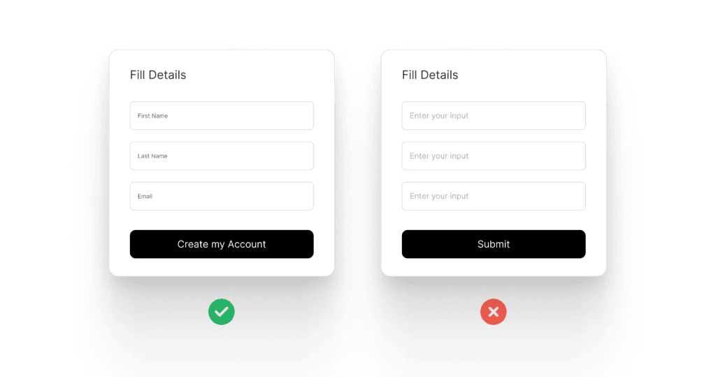
- Enhances Clarity and Reduces Confusion Users need clear guidance to complete tasks. Poorly written microcopy leads to frustration, while effective microcopy in UX ensures users know exactly what to do. For example, changing a button from “Submit” to “Create My Account” provides clarity about what’s happening next.
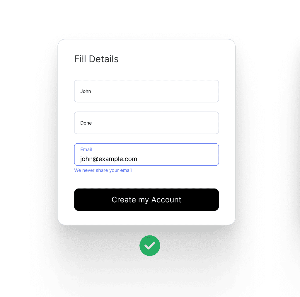
- Improves User Trust and Confidence Trust is crucial in UX. If users feel uncertain, they might abandon a process. Microcopy reassures them. For instance, “We never share your email” under a signup form builds trust.
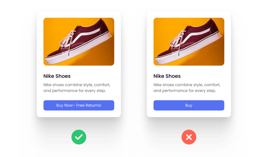
- Encourages Action and Engagement Well-crafted microcopy drives user engagement. Instead of a generic “Buy,” an e-commerce site might use “Add to Bag – Free Returns!” This small tweak reassures users and encourages action.
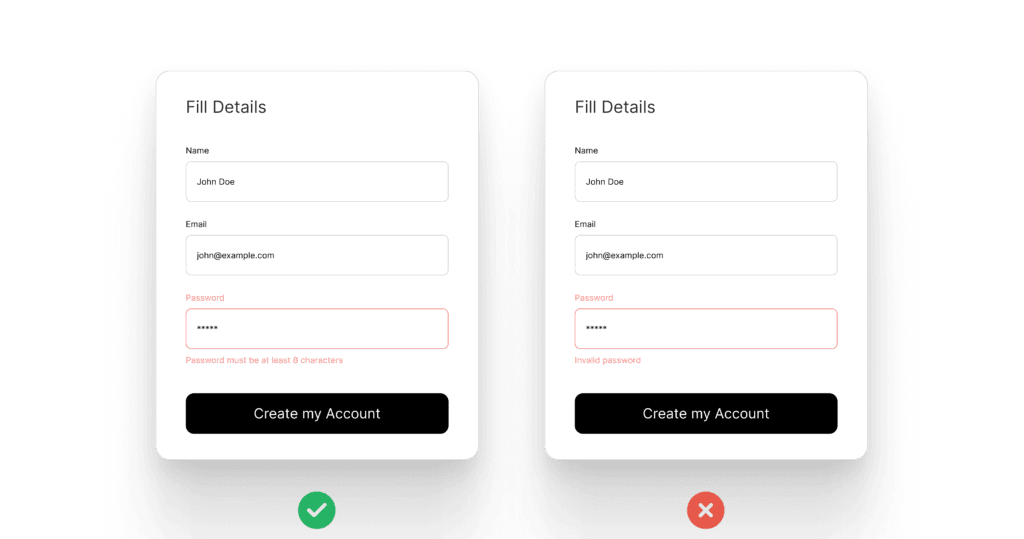
- Reduced Errors and Frustration Error messages should be helpful, not just alerts. “Password must be at least 8 characters” is better than “Invalid password.” A clear microcopy in UX approach prevents frustration and ensures a seamless user experience.
- Boosts Brand Personality and Identity Every brand has a unique voice, and microcopy can reinforce that identity. A tech startup might use fun, engaging language, while a bank might use a more professional tone. Aligning microcopy with branding strengthens user perception.
How to Write Effective Microcopy in UX
1. Keep It Clear and Concise
Users don’t want to read long explanations. Microcopy in UX should be direct and to the point. Instead of “Click the button below to continue,” just say “Continue.”
Example:
✅ “Upload a file (Max: 5MB)”
❌ “Please make sure your file is no larger than 5MB before uploading.”
2. Be Conversational and Human
Microcopy should feel like it’s written by a human, not a robot. Use friendly and natural language.
Example:
✅ “Oops! That password doesn’t match. Try again.”
❌ “Error: Password mismatch.”
3. Use Action-Oriented Language
Action words encourage users to take steps. Instead of passive language, use verbs that drive action.
Example:
✅ “Get Your Free Trial”
❌ “Free Trial Available”
4. Address User Concerns
Users often hesitate before completing actions. Proactively addressing concerns can boost engagement.
Example:
✅ “We’ll never post on your behalf.”
❌ “By signing in, you allow full access.”
5. Add a Touch of Personality
If it fits your brand, injecting personality can make microcopy engaging and memorable.
Example:
✅ “Uh-oh! That email looks funky. Try again?”
❌ “Invalid email address.”
6. Optimize for Different Devices
Microcopy in UX should work well on both desktop and mobile devices. Since screen space is limited on mobile, keep messages short and essential.
Example:
- Desktop: “You can change your settings in the profile section under ‘Preferences.’”
- Mobile: “Go to Profile > Preferences to change settings.”
Additional Considerations for Microcopy in UX
1. Aligning Microcopy with Brand Voice
Microcopy should reflect your brand’s tone and personality. A financial institution might use a formal tone, while a gaming app might be playful and fun.
Example:
- Formal: “Your transaction has been processed successfully.”
- Playful: “Boom! Your payment went through. Happy shopping!”
2. The Role of Microcopy in Accessibility
Microcopy in UX should be inclusive. Screen readers rely on well-written microcopy to guide users with disabilities.
Example:
- Instead of “Click here,” use “Learn more about our services.”
- Instead of vague alt text, use descriptive text: “Red button labeled ‘Subscribe Now.’”
Examples of Great Microcopy in UX
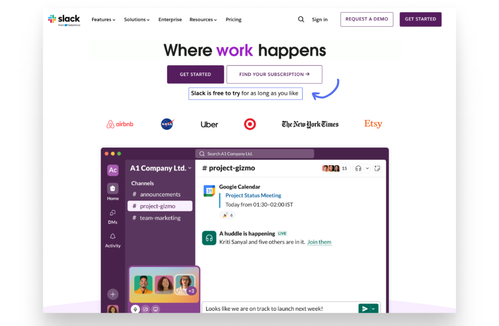
1. Slack’s Playful Onboarding
Slack uses friendly and encouraging microcopy throughout its onboarding process. A great example is their messaging: ‘Slack is free to try for as long as you like.’ This reassures users and removes hesitation, making the onboarding experience smooth and inviting.
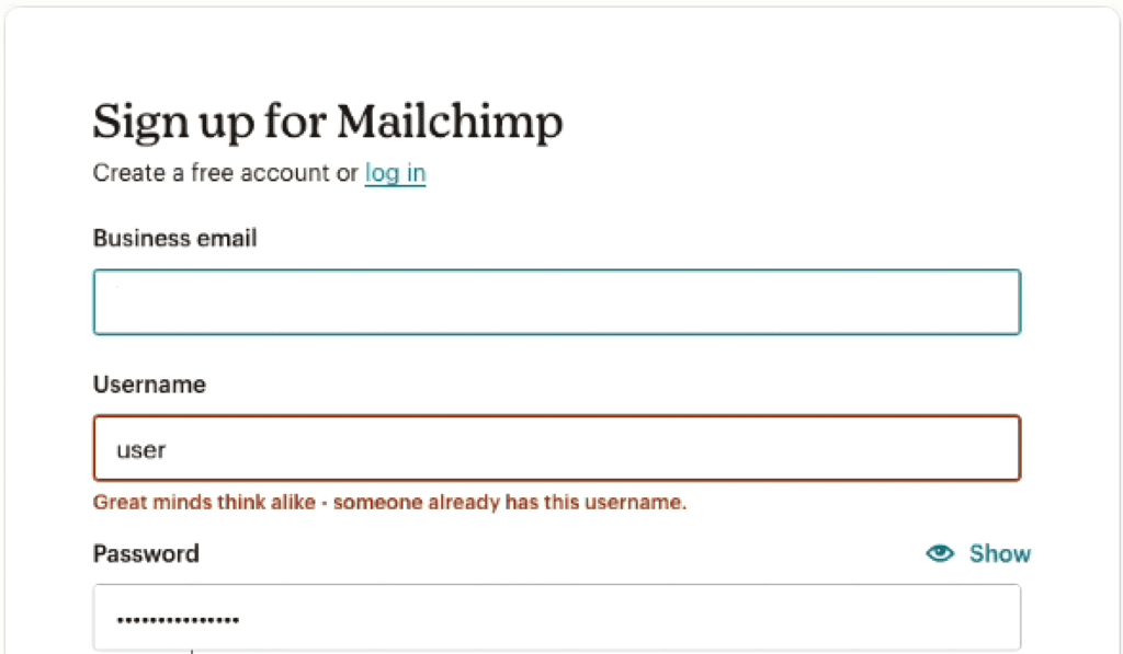
2. Mailchimp’s Error Messages
Mailchimp uses playful and relatable microcopy to ease user frustration. Instead of a dry, technical message, it says: “Great minds think alike – someone already has this username.” This friendly approach humanizes the experience, turning a potential point of irritation into a moment of delight.
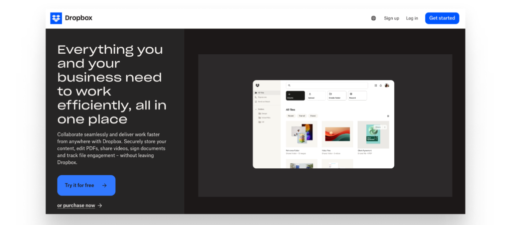
Dropbox’s Effective Value Proposition
Dropbox’s microcopy, “Everything you and your business need to work efficiently, all in one place,” effectively communicates its value by focusing on convenience and productivity. It speaks directly to business users, reassuring them that Dropbox offers a centralized, streamlined solution for all their work needs, making it clear, concise, and relevant to its target audience.
4. Swiggy’s Cart Reminders
Swiggy uses engaging microcopy to enhance user experience. For instance, when a user’s cart is empty, it displays: ‘Your cart is getting lonely. Fill it up with all things good!’ This playful and inviting message encourages users to add items while making the experience feel friendly and engaging.

The Role of A/B Testing in Microcopy
Even small wording changes can impact user behavior. A/B testing helps determine what works best. For example:
- Version A: “Start Your Free Trial”
- Version B: “Get Started – No Credit Card Required”
A test might reveal that Version B increases sign-ups because it removes a common concern.
Common Mistakes to Avoid
- Being Too Vague
Bad: “Continue”
Better: “Continue to Checkout” - Using Technical Jargon
Bad: “Authentication failed”
Better: “Incorrect password. Try again.” - Overloading with Information
Bad: “By clicking here, you agree to our Terms and Conditions, Privacy Policy, and Cookie Policy.”
Better: “By signing up, you agree to our Terms.”
Conclusion
Microcopy in UX may be small, but its impact is massive. It enhances clarity, builds trust, encourages action, and improves overall user satisfaction. By prioritizing microcopy in UX, businesses can create seamless and engaging user experiences that foster long-term user loyalty.
Want to dive deeper into UI/UX design? Click here for more insightful blogs: uiuxdesigntrends.com
Frequently Asked Questions
What is the difference between microcopy and UX writing?
Microcopy refers to short, action-driven text snippets that guide users during specific tasks, like button labels or error messages (e.g., “Invalid password, try again”)
UX writing is the broader practice of creating all text within a product, including headings, onboarding instructions, and microcopy itself (e.g., “Welcome! Let’s set up your profile.”).
In short:
- Microcopy is a part of UX writing.
- UX writing handles the entire text-based experience, while microcopy focuses on specific user interactions.
What is microcopy used for?
Microcopy is used to guide, inform, and reassure users during interactions with a product or interface. It improves usability by providing helpful instructions, reducing friction, and enhancing clarity. Examples include button labels, form hints, error messages, and tooltips.