
Embarking on the journey of UI/UX design is exciting but also fraught with common pitfalls. Many designers, no matter how excited they are, fall into traps that hamper their designs’ usability and aesthetics. Let’s plunge into 10 common UI/UX mistakes that beginner’s fall for and how you can avoid them to create user-friendly and visually appealing designs.
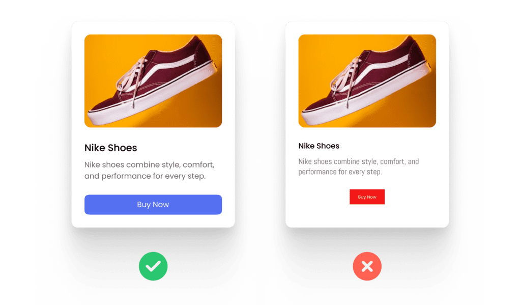
1. Inconsistent UI Visuals
Consistency is the backbone of successful UI design. Beginner’s at times use several fonts, varying button styles, or inconsistent colors, which confuse users. Imagine opening a banking app where every screen looks different — it’s frustrating and feels unprofessional.
Why It’s a Problem: Users rely on familiarity to navigate interfaces. Inconsistent designs disrupt their flow, leading to frustration.
Example: If you use a blue button with rounded corners for primary actions on one screen and a red button with sharp corners on another, users won’t know what to expect.
Pro Tip: Develop a style guide or design system that includes typography, colors, button styles, and layouts. Tools like Figma are excellent for maintaining consistency.
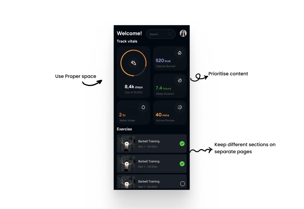
2. Overcrowded Designs
More isn’t always better. Beginner’s sometimes cram too much information onto a single screen, thinking it will save users’ time. However, clutter overwhelms users, making it hard to focus on what’s important.
Why It’s a Problem: Overcrowded designs are unreadable and hard to navigate, leaving users feeling lost.
Example: A travel booking app that displays flight options, hotel deals, and weather updates all on one screen can overwhelm users instead of helping them.
Pro Tip: Embrace white space. It’s not wasted space; it’s breathing room for your design. Prioritize content using visual hierarchy and ensure each element has its own space.
3. Poor Contrast UI
Contrast isn’t just a design principle; it’s a necessity for accessibility. Beginner’s often choose color schemes that lack sufficient contrast, making text or buttons hard to see, especially for users with visual impairments.
Why It’s a Problem: Low contrast can make your UI unreadable, excluding a significant portion of users.
Example: Light gray text on a white background may look nice but is hard to read, especially in bright environments.
Pro Tip: Use tools like WebAIM’s Contrast Checker to determine whether your color combinations meet accessibility standards. Aim for a contrast ratio of at least 4.5:1 for text.

4. Ignoring Responsiveness
With users accessing designs on various devices, responsiveness is crucial. Beginner’s sometimes focus solely on desktop layouts, forgetting that users also interact on tablets and smartphones.
Why It’s a Problem: Non-responsive designs lead to poor user experiences on smaller screens, such as text or buttons becoming too small to interact with.
Example: A shopping website designed only for desktop might show cropped product images or require excessive zooming on mobile devices.
Pro Tip: Adopt a mobile-first approach. Start designing for smaller screens and scale up. Use Figma’s auto-layout feature to create responsive designs efficiently.

5. Neglecting User Feedback
Feedback is essential for enhancing user experience. This includes giving real-time feedback during interactions and gathering insights from users about their overall experience.
Why It’s a Problem: When users don’t receive feedback for their actions, such as error messages in a form or confirmation after submitting data, it leaves them unsure of what happened. Similarly, not collecting feedback from users prevents designers from addressing pain points and improving the design.
Example: A form that doesn’t indicate missing required fields or fails to confirm successful submission can leave users confused. Additionally, neglecting feedback tools like surveys or usability tests means missed opportunities to refine the design.nching a food delivery app without testing its usability might reveal later that users struggle to locate the checkout button.
Pro Tip: Provide clear, immediate feedback, such as error messages, success confirmations, or loading indicators. Use surveys or usability tests to gather valuable insights and continuously improve your designs.

6. Overusing Animations
Animations can be great for designs, but adding too many transitions and effects that serve no real purpose can backfire.
Why It’s a Problem: Excessive animations can slow down performance and frustrate users.
Example: A navigation menu that takes 3 seconds to slide into view every time the user clicks isn’t user-friendly.
Pro Tip: Use animations sparingly. Ensure they enhance usability, like guiding attention to an important feature, rather than distracting users.
7. Skipping Wireframes
The mistake of diving straight into high-fidelity designs without creating wireframes is a common issue. Wireframes allow you to plan layouts and user flows without getting caught up in details.
Why It’s a Problem: Without wireframes, your design process can lack direction, leading to costly revisions later.
Example: Designing an e-commerce app directly in high fidelity, only to realize later that the checkout flow is confusing.
Pro Tip: Spend time on low-fidelity wireframes to map out user flows. Tool like Figma is great for this. It also supports multiple plugins that helps in wireframing, such as Wireframe Designer, UX Pilot, etc.

8. Ignoring Accessibility
Accessibility is not a nice-to-have, but a must-have. Overlooking features like keyboard navigation or screen reader compatibility alienates users with disabilities.
Why It’s a Problem: Ignoring accessibility limits your audience and can even result in legal issues in some regions.
Example: A form that doesn’t have labeled input fields makes it unusable for screen reader users.
Pro Tip: Follow Web Content Accessibility Guidelines (WCAG). Simple actions like adding alt text for images and ensuring keyboard navigability can make a big difference.

9. Overlooking Microinteractions
Microinteractions, such as a button changing color when hovered over, adds to user experience. Beginner’s often skip these small details, leading to designs that feel lifeless.
Why It’s a Problem: Without microinteractions, users might find your design less engaging or intuitive.
Example: A form submit button that provides no feedback when clicked leaves users wondering if their action was successful.
Pro Tip: Incorporate subtle microinteractions to guide users. Tools like Lottie can help you add lightweight animations.
10. Overcomplicating Navigation
Complex navigation structures confuse users and make it hard to find information. Sometimes, Beginner’s try to reinvent the wheel instead of sticking to familiar patterns.
Why It’s a Problem: Confusing navigation leads to frustration and high bounce rates.
Example: A news website with a hidden menu and no clear categories will drive users away.
Pro Tip: Keep navigation simple and intuitive. Stick to established patterns such as a top navigation bar for desktops and a bottom navigation bar for mobile devices.
Avoiding UI/UX Design Mistakes
Mistakes are part of the learning process in UI/UX design, especially for beginners. The key is to identify and fix these common UI/UX mistakes to create designs that are not only visually appealing but also user-friendly. By maintaining consistency, ensuring accessibility, and embracing feedback, you’ll continually improve your skills.
Remember, great UI design isn’t about perfection but progress. Keep learning, testing, and refining — your users will thank you for it! Ready to take your UI/UX design skills to the next level? Check out more tips and tools in our Beginner’s Guide to enhance your design journey!
Frequently Asked Questions
What are the 4 golden rules of UI design?
The 4 golden rules of UI design are:
- Consistency: Maintain uniformity in fonts, colors, and layouts across the interface.
- Feedback: Provide immediate, clear responses to user actions (e.g., button clicks).
- Simplicity: Keep the design intuitive and easy to navigate, avoiding unnecessary complexity.
- Error Prevention: Design interfaces that minimize user errors and offer easy recovery options.
These principles ensure a user-friendly and efficient design.
What is the 6-3-1 rule in UI design?
The 6-3-1 rule in UI design defines the proportional use of colors in a design:
- 60%: Dominant color used for backgrounds or large areas.
- 30%: Secondary color for UI elements like cards, sections, or highlights.
- 10%: Accent color for calls-to-action or key elements to draw attention.
This rule ensures a balanced and visually appealing color scheme.
What is the 80 20 rule in UI UX?
The 80/20 rule in UI/UX design, derived from the Pareto Principle, suggests that:
- 80% of outcomes (user engagement, task success) come from 20% of features or elements in a design.
This means designers should focus on the most impactful features or interactions that drive the majority of user value, streamlining the interface and improving usability.